開始讀正文之前先來聽首歌吧!
記得當年 YouTube 進度條出來的時候好像造成一片轟動,突然之前大家爭先恐後 implement 它,蔚為風潮;而當年 implementation 中的佼佼者就是 NProgress,到了現在還是盤據一方(?)。
其實之前也不乏做過類似的進度條效果,不過從來沒有特別對 peg 的部分雕琢(或著說根本沒有加)。
什麼是 peg 呢? 來看一下 NProgress 裡面的一段 CSS code
/* Fancy blur effect */
#nprogress .peg {
  display: block;
  position: absolute;
  right: 0px;
  width: 100px;
  height: 100%;
  box-shadow: 0 0 10px #29d, 0 0 5px #29d;
  opacity: 1.0;

  -webkit-transform: rotate(3deg) translate(0px, -4px);
      -ms-transform: rotate(3deg) translate(0px, -4px);
          transform: rotate(3deg) translate(0px, -4px);
}
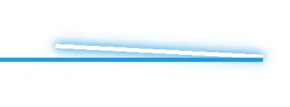
實際上看起來的效果是
這個小小的點綴其實為這個進度條增色了非常多,因為進度條本體的高度並不高,透過這個 peg 可以再它動作的時候達到比較好的吸引注意力的效果,讓使用者更容易意識到有什麼東西在動作中。
這個效果其實 YouTube 版本的進度條上面就有,不過我從來沒有好好正眼看過它(一閃即逝嘛)。最近的專案又做了類似 YouTube 的進度條,於是默默決定應該要好好地看一看 YouTube 的 peg 是怎麼做的,便開始了這次尋找流星的旅程。
讓時間暫停吧! DOM Breakpoint
只要在 YouTube 裡面切換影片的時候打開 DevTools 就知道,進度條並不是固定在 DOM 裡面的,它在需要的時候被 append 到 <body> 上,一跑完馬上就被移除了。這樣我們要如何能夠好好看它幾眼呢?
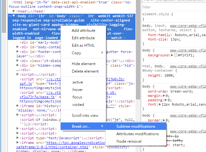
好在 DevTools 其實有支援 DOM Breakpoint,這個其實蠻實用但好像又很少用到的功能(可能大部分時候都是用在偷看人家網站),它可以在 DOM 節點上面設定需要 break 的時機,可以讓當下做 DOM 修改的 js code 在 debugger 中暫停,然後你就可以窺探所有 DOM & js 的秘密(笑)
這邊簡單用 3 步驟來說明一下如何看到 YouTube 上進度條的真身(點擊可看大圖):
-
打開任意 YouTube 影片,在廣告播完(?),正片開始之後按下暫停。
-
打開 DevTools,在
<body>上設定 Break On -> Subtree Modifications
-
接著點擊畫面上任意影片,搭配按 F8 (繼續執行),直到有看到
<body>下出現<div id="progress">就得手啦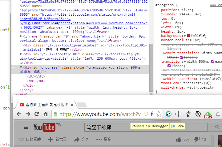

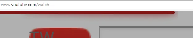
於是來看看我們從上面得到的成果吧!
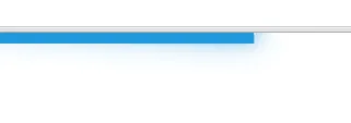
首先是截圖一張。
再來是 HTML & CSS
<div id="progress" class="" style="transition-duration: 900ms;width: 40%;">
	<dt></dt><dd></dd>
</div>
#progress {
  position: fixed;
  z-index: 2147483647;
  top: 0;
  left: -6px;
  width: 0%;
  height: 2px;
  background: #b91f1f;
  border-radius: 1px;
  -moz-transition: width 500ms ease-out,opacity 500ms linear;
  -webkit-transition: width 500ms ease-out,opacity 500ms linear;
  transition: width 500ms ease-out,opacity 500ms linear;
  -moz-transform: translateZ(0);
  -ms-transform: translateZ(0);
  -webkit-transform: translateZ(0);
  transform: translateZ(0);
  will-change: width,opacity;
}

#progress.done {
  opacity: 0;
}

#progress dd,#progress dt {
  position: absolute;
  top: 0;
  height: 2px;
  box-shadow: #b91f1f 1px 0 6px 1px;
  border-radius: 100%;
}

#progress dd {
  opacity: .6;
  width: 20px;
  right: 0;
  clip: rect(-6px,22px,14px,10px);
}

#progress dt {
  opacity: .6;
  width: 180px;
  right: -80px;
  clip: rect(-6px,90px,14px,-6px);
}
CSS clip: rect()
可以看到 YouTube 版本的做法比較複雜,而且不知道為啥還使用了 clip: rect()。
先來看一下 MDN 上對 clip: rect() 裡面數字的解釋吧
A rectangular <shape> of the form rect(<top>, <right>, <bottom>, <left>) or of the form rect(<top> <right> <bottom> <left>) (which is a more backwards compatible syntax) <top> and <bottom> specify offsets from the inside top border edge of the box, and <right>, and <left> specify offsets from the inside left border edge of the box — that is, the extent of the padding box. <top>, <right>, <bottom>, and <left> may either have a <length> value or auto. If any side’s value is auto, the element is clipped to that side’s inside border edge.
簡單的說就是從原本的元素身上切一塊長方形下來,而可以透過 rect() 來指定那一塊的 top, right, bottom, left 座標,了解之後,我們分別把 <dt> 和 <dd> 做成 demo。
上面的 bar 是一般狀態,下面的則是把 clip 去掉之後加上 background-color,並且標明了原本 clip 的範圍。
玩玩 demo 可以發現原來這麼大費周章地用 clip 切成兩塊,竟然只為了… 做出那個形狀。
動手玩玩看
看完上面的 demo,並且經過一些計算之後我們可以得到下面的一些算式,來協助我們客製化自己想要的形狀(比如說想要寬度短一點之類的,畢竟現在的寬度主要適用於較大的螢幕)。
ratio = 10  // 頭佔整體多少比例
width = 100  // 整體寬度
blurRadius = 6  // 陰影發散程度(unit: px)
bottomBlurRadiusRatio = 14 / 6  // 套用了目前 YouTube 版本的比例

頭寬度 = width * (ratio / 100) * 2
尾寬度 = width * 2 - 頭寬度

頭right = 0
頭clip = {
  top: -blurRadius,
  right: 頭寬度 + blurRadius,
  bottom: blurRadius * bottomBlurRadiusRatio,
  left: 頭寬度 / 2
}

尾right = -(尾寬度 - 頭寬度) / 2
尾clip = {
  top: -blurRadius,
  right: 尾寬度 / 2,
  bottom: bottom: blurRadius * bottomBlurRadiusRatio,
  left: 0 - blurRadius
}
接著把這個做成一個可以動的 demo (built with Angular)。 Magic!
後記
我個人覺得做為一個好的前端工程師,最重要的特質是對細節的追求,這點在 YouTube 這個流星上面真是體現得頗為徹底。
你可能會想說,NProgress 的版本不是很簡單就可以達到同樣效果嗎?
對,在單側不可見的情況下確實可能透過 NProgress 的解法比較快,不過如果這個進度條是上下都還會有內容的話,NProgress 的做法就不適用囉~